REDUCING CHECKOUT FRICTION AT SCALE

REDUCING CHECKOUT FRICTION AT SCALE

YEAR

YEAR

2026

ROLE

ROLE

Lead Product Designer

Context.

Supporting a £300m+ global beauty business through a complete redesign of the e-commerce checkout experience.

Supporting a £300m+ global beauty business through a complete redesign of the e-commerce checkout experience.

Problem.

Problem.

As Charlotte Tilbury rapidly scaled, checkout had become one of the weakest parts of the customer journey. Analytics, behavioural data and an independent Baymard audit all pointed to significant friction throughout the experience.

As Charlotte Tilbury rapidly scaled, checkout had become one of the weakest parts of the customer journey. Analytics, behavioural data and an independent Baymard audit all pointed to significant friction throughout the experience.

42%

Guest abandonment

46%

Bounce rate

46%

Bounce rate

56

Usability issues identified

Form errors in audit

My Role & Strategy.

Combining behavioural data, Baymard recommendations and close collaboration with Product and Engineering, we prioritised improvements that simplified the journey while creating a scalable foundation for future optimisation.

Combining behavioural data, Baymard recommendations and close collaboration with Product and Engineering, we prioritised improvements that simplified the journey while creating a scalable foundation for future optimisation.

I then came up with 4 key design principals:

1. Reduce unnecessary decisions - remove friction wherever possible.

2. Preserve customer context - keep shoppers oriented throughout checkout.

3. Build reusable foundations - create patterns that scale beyond this release.

4. Balance UX with technical reality - prioritise solutions that can be delivered and evolved.
Key Product Decision #1
One Continuous Checkout.

Key Product Decision #1
One Continuous Checkout.

Usability testing, analytics and Baymard research all pointed to unnecessary context switching between checkout steps. Rather than optimising individual pages, we redesigned the journey as a progressive single-page experience, reducing navigation while preserving customer context.

Usability testing, analytics and Baymard research all pointed to unnecessary context switching between checkout steps. Rather than optimising individual pages, we redesigned the journey as a progressive single-page experience, reducing navigation while preserving customer context.

Key Product Decision #2
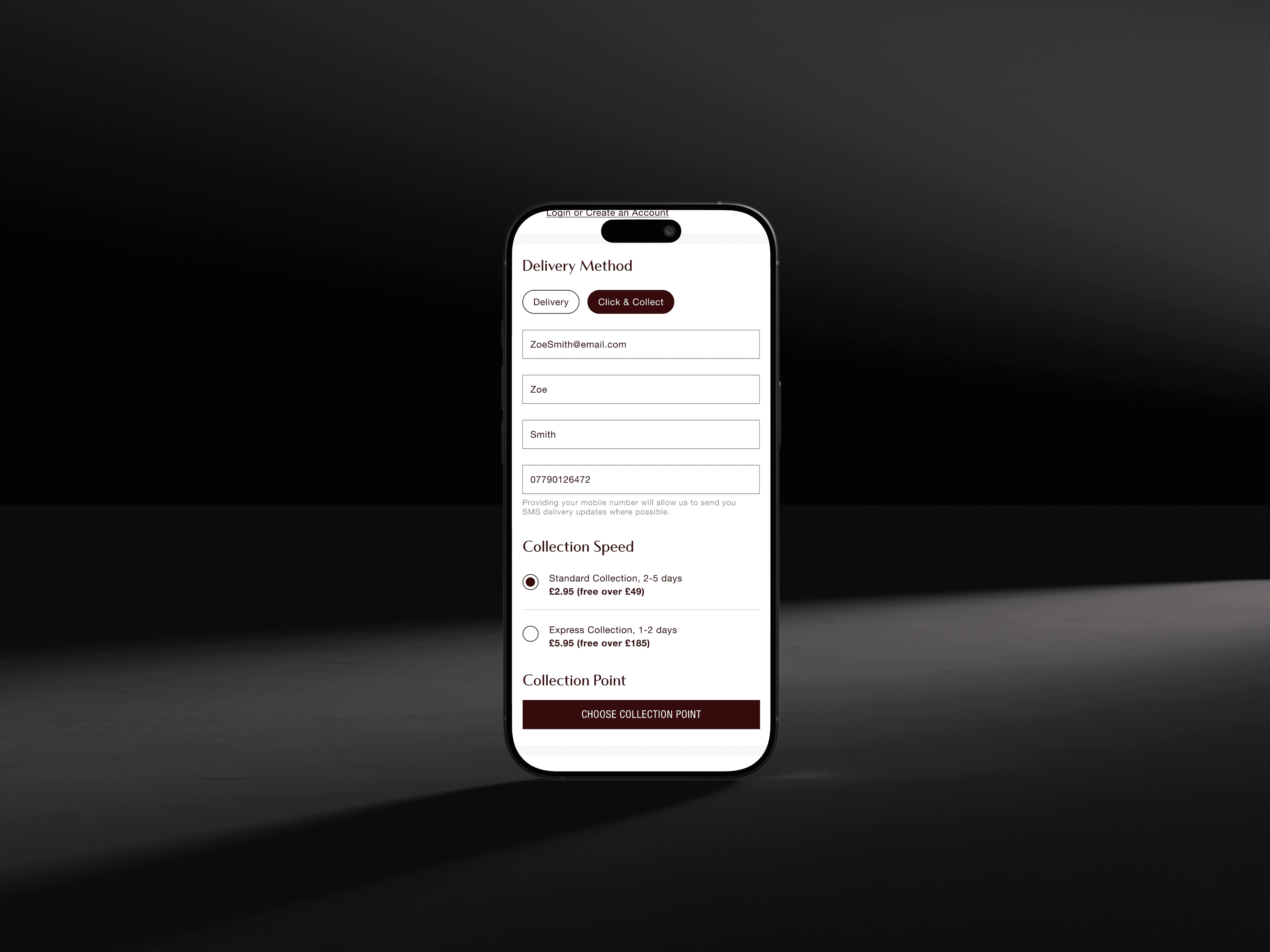
Simplifying Click & Collect.

Key Product Decision #2
Simplifying Click & Collect.

Click & Collect represented around 30% of orders but remained one of the highest-friction checkout journeys. Working within Evri’s API constraints, we simplified selecting, editing and recovering collection points while reducing unnecessary customer effort.

Click & Collect represented around 30% of orders but remained one of the highest-friction checkout journeys. Working within Evri’s API constraints, we simplified selecting, editing and recovering collection points while reducing unnecessary customer effort.

Key Product Decision #3
Removing Unnecessary Steps.

Key Product Decision #3
Removing Unnecessary Steps.

Every explicit Continue or Submit action creates another opportunity for hesitation. Wherever possible, we removed unnecessary submissions and allowed checkout to progress automatically once enough information had been provided.

Every explicit Continue or Submit action creates another opportunity for hesitation. Wherever possible, we removed unnecessary submissions and allowed checkout to progress automatically once enough information had been provided.

Working Within Constraints.

Working Within
Constraints.

The redesign had to improve the customer experience without ignoring the realities of a mature global checkout platform.

Key Constraints:

  • Third-party integrations

  • Legacy checkout architecture

  • Progressive rollout

  • Cross-functional delivery

The redesign had to improve the customer experience without ignoring the realities of a mature global checkout platform.

Key Constraints:

  • Third-party integrations

  • Legacy checkout architecture

  • Progressive rollout

  • Cross-functional delivery

Impact.

The redesign replaced a fragmented checkout with a more continuous experience, reducing customer effort while creating a stronger foundation for future optimisation.

1. One continuous journey - reduced navigation and preserved context.

2. 30% of orders - supported by the redesigned Click & Collect experience.

3. Reusable patterns - built to scale across future checkout journeys.

Reflection.

Simplifying checkout wasn’t just about improving individual screens. The biggest opportunities came from removing unnecessary steps, preserving customer context and working within the realities of a complex global platform.

The result was a simpler experience for customers, supported by a more scalable checkout foundation.